More insured.
Zilveren Kruis is one of the largest suppliers of health insurance in the Netherlands. They wanted to persuade potential customers to let them know that they are the perfect choice.
Zilveren Kruis is one of the largest suppliers of health insurance in the Netherlands. They wanted to persuade potential customers to let them know that they are the perfect choice.
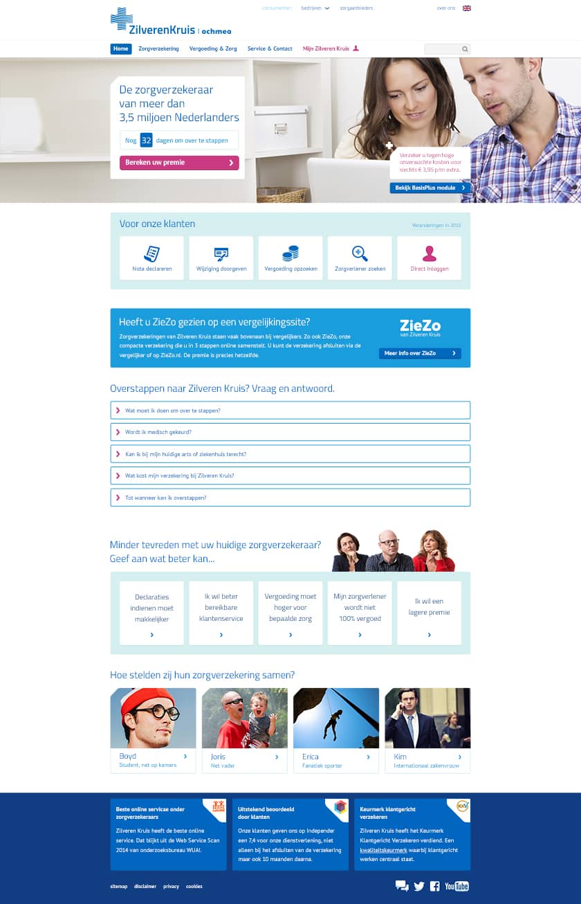
Every year during the months of November and December, citizens of the Netherlands are able to switch to a new health care insurer. By doing so, people would be able to save money on their insurance. Naturally, the health care insurers will be advertising heavily during these months. For Zilveren Kruis, we were tasked to help improve their online conversion for during these crucial months.
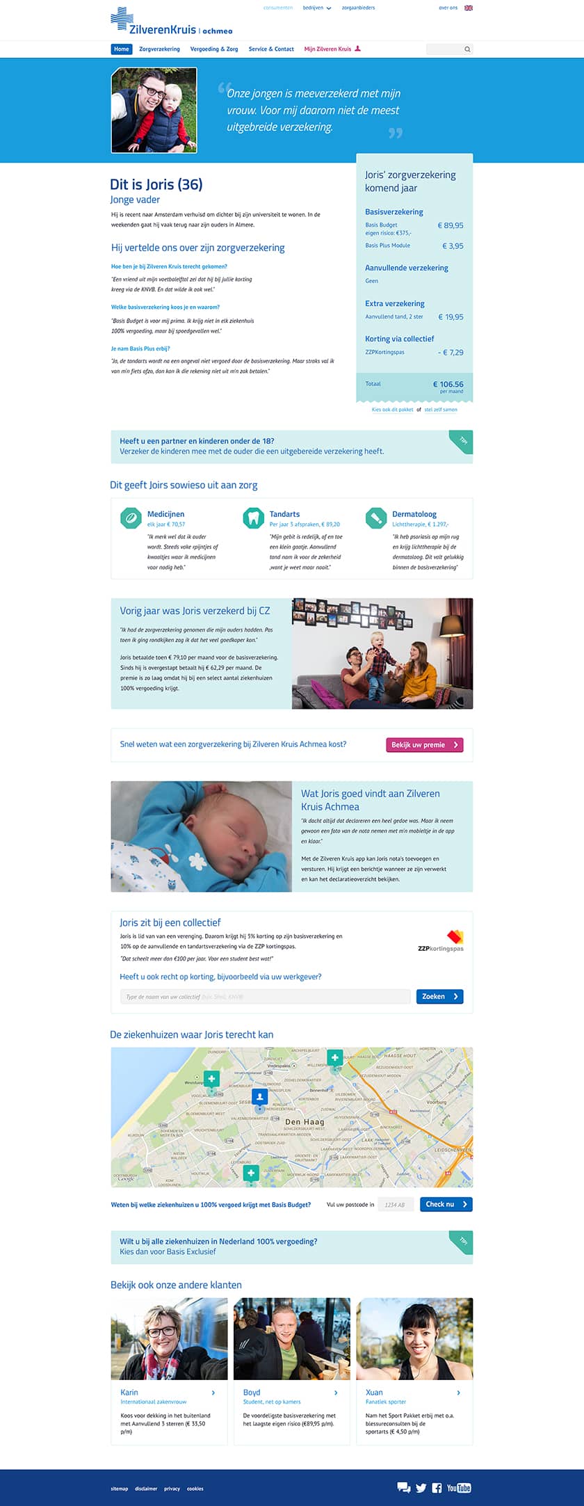
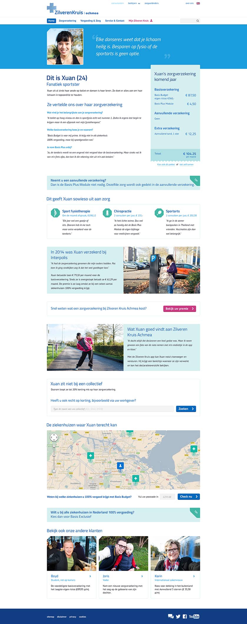
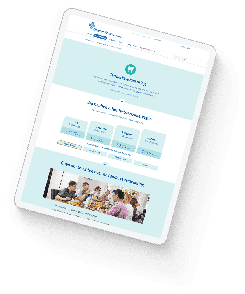
Getting to understand how insurances work in general can be quite challenging. There are always small differences between different suppliers which can be hard to identify. And when we have finally found these differences, most of the time we still do not really understand what they mean. One of the goals of this project was to create more transparency for the customer.
Besides this, we also wanted to change the way a potential customer could turn into a real customer. This meant I had to look at all the different touch points in the complete customer journey for all different types of users.
During this project, we were using Scrum Methodology while I was working closely together with Zilveren Kruis' Digital Agency 'Resoluut'. Resoluut's Art Director was in lead of the design process and oversaw all of my work.
We formed our strategy around the information provided by Zilveren Kruis – who had a direct line with consumers. I mapped out the personas of our target audience and tested them throughout the process with real clients.
The designs created for this project had to fit in with the new website that Zilveren Kruis launched one year ago. This website was also designed by Resoluut which was great for us, as we were working so closely together with them. As my designs were covering many different touch points and restructuring many pages, I fitted everything nicely in the overall style but did try to improve many details. I pushed the complete user journey to an even more modern design and added many new unique elements creating a really unique look and feel, that fitted perfectly with the brand.
By creating more personal content, structuring information better and improving overall navigation, I managed to create an accessible and better-converting website for Zilveren Kruis.