World famous butter.
Kerrygold is Ireland’s largest dairy export product but their old online identity did not reflect this position. They wanted instead come across as the premium brand they are.
Kerrygold is Ireland’s largest dairy export product but their old online identity did not reflect this position. They wanted instead come across as the premium brand they are.
Kerrygold was managing over 10 different websites in various locales. This was obviously very time consuming and did not come across to customers as a consistent experience. They wanted to solve this by having one source of truth, that would apply to multiple different markets.
Besides reducing the resources they had to invest in their digital presence, their old digital identity did not come across as a premium brand that is at the heart of wholesome and great tasting food.
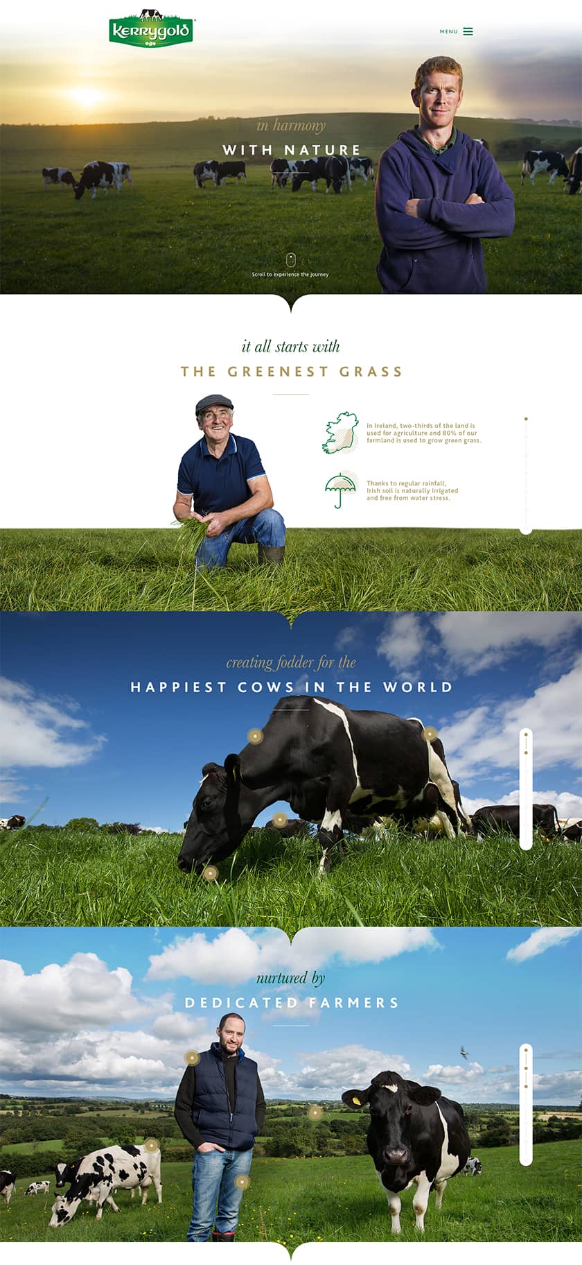
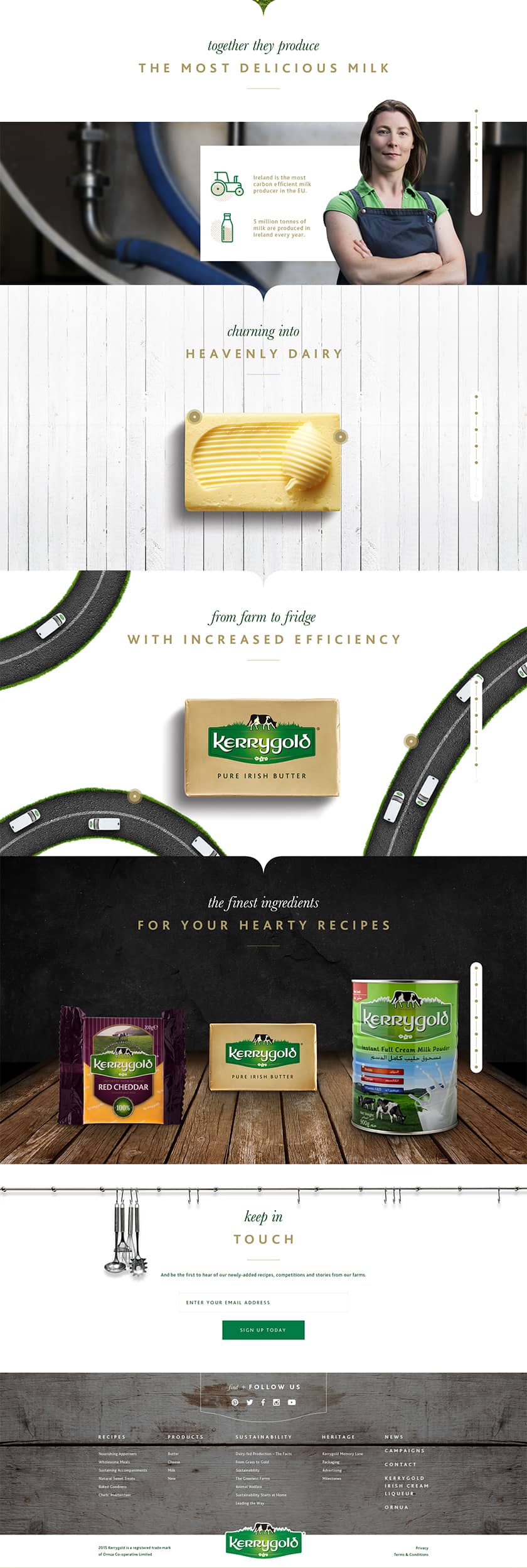
Kerrygold wanted to represent the ‘green reality’ of Ireland and not just a ‘green image’. This is a message that did not echo well enough through the online presence of Kerrygold. A website talking about a product like butter would not be engaging enough for the audience. Because of this, I had a nice challenge ahead of me to frame it differently and keep people engaged with premium content suitable to the brands' essence.
As the new website was going to be launched across different markets in different locales, I had to make sure I was as familiar as possible with these markets. Some markets would for example only sell Kerrygold butter, were others would also sell Kerrygold cheeses.
During the research phase, I spoke to multiple target groups to ensure my assumptions were validated before we started designing. During the design process I continuously iterated the designs based on user testing sessions. A fun fact, is that I was lucky to be able to test the Arabic version with native people. This resulted in some design changes as an increased letter spacing which is applied on the headings, apparently made the characters unreadable.
Collaboration with development was as close as it could be as everything was being developed in-house. As I worked closely with these developers on multiple projects, we knew exactly what we could expect from each other and strived for the highest quality possible.
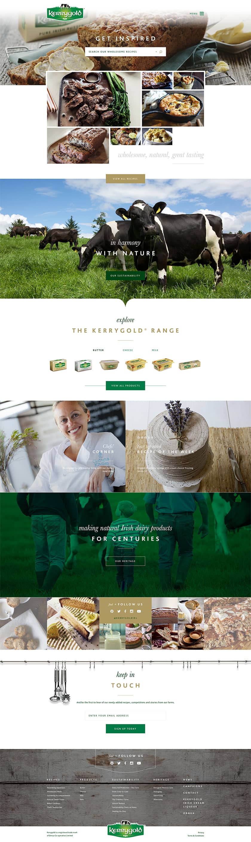
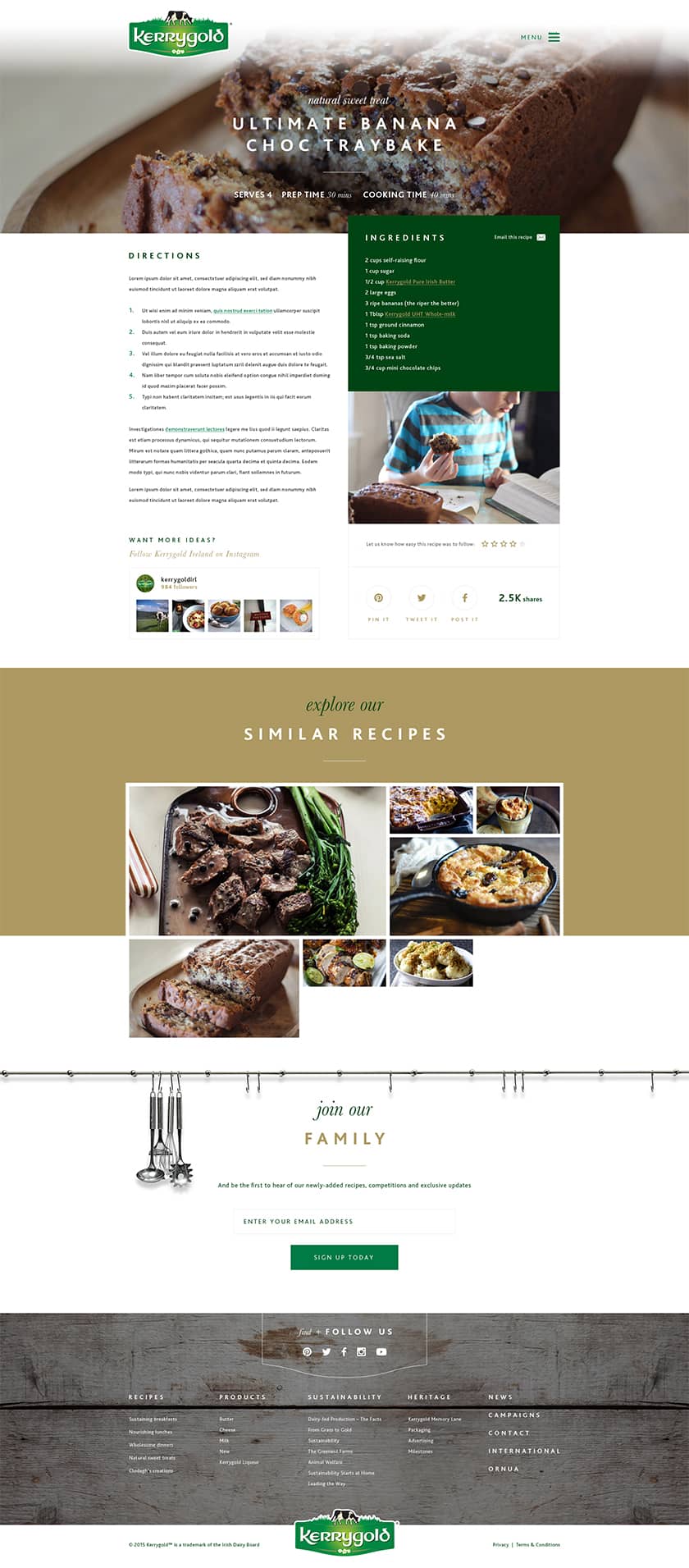
I ended up creating a concept that made the website modular so that it was easy to hide and show relevant information for each of the markets. The website was also made available in Arabic, which meant the designs had to support reading from right-to-left as well as left-to-right. The different recipes that are being presented to the users also change per market, to make sure they suit the local preferences of customers.
As said before, presenting just butter was not a very engaging tactic for the target audience. Therefore, I focused the main content of the website on recipes that can be achieved with using the famous Kerrygold butter. Kerrygold’s audience mentioned over and over again that each of these recipes taste much better when created with Kerrygold. This was a clear statement that we had to build upon and did with great success.